Tuesday, September 21, 2010

Design Readings #2


Without a doubt, it is safe to say that the assigned articles revolve around ethics in contemporary design.  Whether it was  “ Critique of the American Apparel’, ‘ First Things First 64 and 2000 Manifestos’, or ‘ The Responsibilities of the Design Profession’, they all played off of one another as a group to create a view with various angles on today’s design.  That is why it’s important to speak of these articles as a group rather than try to deconstruct them piece by piece.

            Even before reading it, the most appealing article of them all was the ‘Critique of the American Apparel’. One reason being advertisement. Its provoking designs have met the media plenty of times, which immediately cast a lasting impression of the company in my mind.  The article speaks about the ways that are used to bring consumers in. However, the images of young looking girls in a submissive state show the viewer much more than the style of a shirt or the pants the model is wearing. This can particularly clash with the thoughts of the 60’s where designers tried to gear design toward more conservative causes, such as designing book, signs, industrial photography etc… They were trying to establish more useful ways of communication through the skills of design, as seen in the Manifesto 64’ article.
            Furthermore, the Manifesto of 2000 shows that design has now merged same paths with advertising and now are both predominately one of the same. Viewers are now even lured into the image and persuaded by the particular design to go after the product or idea being advertised. It shows that contemporary design is more about the designed product manipulating the way a viewer feels. Poyner however, sill believes as in the 60’ that design should be useful and lasting, but unfortunately it is a factor today’s design still lacks. This is mainly because according to Poyner, today’s designers’ creations are mostly based on the ‘political choice’, meaning rather than having the design used for a lasting purpose, it is used for corporate/commercial purposes.

The article which personally seems the base for the other readings is that of Herbert Spencer and ‘ The Responsibilities of Design Profession.’ Because it was still written in the 60’s, it remains vital for the minds of contemporary designers. The addressed issues in the article are the products of entering a new era in design. Designers being motivated to out do the other, losing of the printing tradition, and overall design becoming more advanced or complex created the system designers live in today. Whether it’s American Apparel or any other company which tends to exploit and use design in a seemingly unethical way according to the original manifesto, they give design this new/ contemporary feel which was never felt before the 60’s. It is important, however, to move forward and develop design and its characteristics because design is essential to the way one views the world and its assets through it.


Monday, September 20, 2010

Welcome Back Show!

Although there were sculptures and numerous other paintings screaming for attention as I walked into the first exhibition space, nothing pulled me into its world as much as this particular piece. Its positioning was perfectly aligned with the view of the one who has just entered the gallery. As I closely explored the painting, its technique became that much more intriguing to my taste. It was the composition which has simply won my attention over. As my eyes were eager to explore the empty black surface in the middle of the canvas along with the orange-yellowish marks created on top, they just could not. It was the simple bright circle on the lower side of the painting, pulling the the eyes along with the weight of the painting to the bottom. Because the painting is vertical and the placement of the circle is at the center, on the lower side of the canvas, it brings the surrounding space into play. We associate the floor with gravity, in which case it is now pulling the circle and the weight of the pictorial surface with it, creating a conceptually pleasing composition.The reason for this particular pick is simple. Already being introduced to a piece with an unusual composition which kept winning my attention over any other extraordinary piece in the room, I was easily lured in by the design stemming from a similar concept of the previous one. The quiet surface of the canvas depicts an intricate layout of positive and negative space, which suddenly becomes overshadowed by the 'scream out' orange -symmetrically placed shapes, yet again at the bottom of the canvas. Once more I must force my eyes away from the tempting orange if I dare to explore the subtle design accompanying the orange shapes on the bottom. It is the simple trick of colors and composition which can overwhelm the viewer that I am most excited for at a show. That is precisely why I have chosen these images.


This next piece visually cooled me down after being exposed to a multitude of colorful pieces in the space. Stripped of its color, one would think it would give out a dull feeling. However, personally it did not. Because of its 3 dimensional feel created by the particular strokes at the center of the surface, the viewer is no longer thinking black and white, but also 3D. The composition is not only created by the presented line quality, but more importantly the negative space which surrounds the shape. In addition, this negative space subtly divides the lines that create the piece and with a lighter tone of the background color holds the strokes together, while giving the dominating shape a 3 dimensional feel. Yet another way to keep my interest alive and eager to look at artwork surrounding me.


Steering away from 2 dimensional work, I arrive at sculptures occupying the same space as the multitude of paintings on the walls. This sculpture in particular seems to give out a unique aura of some sort, that I haven't felt around other work. Although it did not catch my initial attention, it took the remaining time I had to offer for the examination of its interesting design. It was perhaps the color green that gave it this 'out of the world' feel. The thin poles with flat circular platforms on their ends created a network of energy and expression. It seems such factors would be enough to create a sculpture of uniqueness and all else it needs to offer for an art-hungry viewer; It isn't. After taking a closer glimpse, perhaps even a touch (shhh) it was clear the design was precise about its presentation. As it could only stand on one side, it became baffling how there seemed to be more weight on the other. A well thought out plan on the part of the artist and a great feat of exploration for the viewer.


Ending this review with another 3 dimensional piece, I must say the few sculptures there were, they did balance out the 2D work, simply because of their interesting concepts which had that much more to offer for the viewer. This piece works well conceptually with the green sculpture as it too has an unconventional positioning of the cube. Right next to it is an object being connected with yet another interesting feature. The three create a sense of brotherhood and belonging to one space. It is the    object that is binding the two that lets the viewer know it is a sculpture of one. Without this connection one could be lost and lose the feeling of belonging. The metallic look of the cube creates a contrast between it and  the dark part of the sculpture sitting next to it.  That is a subtle factor, however important in keeping the 3D piece interesting. However, the main factor which brings all this pieces in this review together is obscurity. Personally I found it important to look at these pieces and create interpretations without knowing their names. It brings that much more curiosity into play as well as more room of exploration.

Thursday, September 16, 2010

Interview with Enrique Guerrero


The privilage of interviewing student artist Enrique Guerrero was all mine. He gave me the opportunity to walk into his world and explore the ways he has taken to create art of his own. He has shown me the importance of thoughts and feelings which embody his paintings, as well as the role of symbolism he uses to convey messages dear to him. Unlike artists who strive to convey a theme through a particular painting style, Enrique aims to depict his themes or message strictly through the visual content. However, to fully understand Enrique's world of art, it is imperative to dwelve into the conversation the artist and I engaged in.


Me: So, this is a self-portrait. It's a very dark painting. Is it about sadness?
Enrique: No, it's about identity, It symbolizes me. Me and my personality. People are defined by what they do.
Me: Does the brush you painted represent anything?
Enrique: Yea, the brush symbolizes me. Me and my personality.
Me: Ok
Enrique: You know like, people are defined by what they do. It's like when a bussines person carries a briefcase, they are defined by it. So when people ask you, "What do you do for a living?" And you say "I'm an artist", you have that brush. But here, the brush is painted on the floor, so I lost my identity, and people can't define who I am anymore, that's why there is darkness painted behind me.
Me: hmm... I see you also have a collage.
Enrique: Yes. I'm trying to depict people here who are forced to live a bad life because of a war. I used the American Eagle logo to represent America in the Iraq war.
Me: Why did you choose to write over it, especially, the word 'life' in red?
Enrique: I want to make it dramatic. That's why I used a brush and just expressivelly wrote it in red. 
Me: Why do you also like collages?
Enrique: I like to deal with real, physical things, and put them together.
Me: What else interests you?
Enrique: I'm also into religious pieces. For example I have a painting of my friend, with a composition of one of Caravaggio's paintings.
Me: I see you have a nice portait. Your friend?
Enrique: Yea.
Me: Hm..she's kinda cute...does she go to school here?
Enrique: Heh, yea.
Me: Your style seems very solid and the painting looks rendered to the last detaill. It looks finished.
Enrique: Like you said, you rarely know when a painting is finished. I have the same issue.
Me: The painting does give out a sense of feeling.
Enrique: Yea I try to show the feeling with what I depict. I know you try it with the way you paint.
Me: Yea...is she a senior?
Enrique: Junior I think, hehe.
Me: Another selfportrait. I feel like you're trying to symbolize something here.
Enrique: This is also about identity. I want to show that I'm more reserved with the way I painted it. The look and being in 
the dark.
Me: Portraits I see here resemble Picasso style a bit.
Enrique: Yea I've been told that many times before. I've been looking at Picasso, Gaugin, and some Expressionists This painting was supposed to be realistic but then I felt like I wasn't going anywhere with it, so I just decided to paint it loosely and do whatever comes to my mind.
Me: I feel like you were trying to paint it realistically, but could'nt do it, so you turned to abstact.
Enrique: Well, it's not that I couldn't do it, I just thought it was dead and that it could be more interesting.
Me: So sometimes when you paint realistically, you feel like your paintig is dead?
Enrique:Yea sometimes. I just feel it. Like there's something missing.
Me: What oils do you paint with?
Enrique: Old Hollands. Usually when I paint, I first paint the base black and work from there.
Me: I feel like you're using a particular technique.
Enrique: I sometimes read books on old masters and their techniques and get ideas from there.
Me: Do you use any spirits when you paint?
Enrique: Yea, Liquin and I add it with the paint. It also helps the paint dry faster.
Me: Do you prepare you palette before you go painting?
Enrique: No, I use the canvas as my palette. I have a a blue, red, green,yellow, and white and mix them on the canvas.
Me: I lso feel like you have a drawing quality to your paintings.
Enrique: Yea, I love Da Vinci's drawings. He's my favorite artist.
Me: How long have you been painting?
Enrique: Since High School. I liked drawing and painting from the beginning.
Me: I feel like all your drawings and paintings have similar qualities I could quickly recognize.
Enrique: Yea should we keep going?
Me: Nom I think we're good...Thanks.


Monday, September 13, 2010

Design Readings...


No Logo
By Naom Klein

·      Branding is being preferred over production by companies
·       Branding dwells on the idea of one’s lifestyle
·        The teenager becomes a global factor

Naomi Klein tries to point out the actions of multitude of American companies that are trying to catch the attention of the regular American shopper. Such companies switched their original priorities, which were based around production of goods, and aimed to achieve the best marketing techniques to gain the consumer’s trust. This article is mainly based on the economical part of the general system.  Basically companies which moved their production overseas, now could concentrate on brand marketing


Branding the Individual
By Jane Pavitt

·      Shopping is a way of communication
·      The consumer defines the brand and the brand defines the consumer
·      Buying not only merchandise, but an identity


Unlike Naomi Klein, Pavitt focuses on the more physiological aspect of branding. She emphasizes that companies lure the consumers in by letting them know they are buying an identity. Even though the consumer feels as if they have the choice to purchase what they want, in most cases they don’t because of the manipulative media and marketing the companies use. This creates numerous problems within communities who are driven to compete with one another over who has the better brand and are therefore are divided into a different social status.

Fabien Baron
By John Seabrook

·      Aspires to always keep moving forward
·      Wants to create a movement
·      Known for ‘letting the oxygen in”

Fabien Baron seems to be of a different personality who likes to go with the flow and always move forward. He has created “The Club”, which is a group bringing artists from various fields together and aspires to create a movement where art becomes direct, simple, and forward. It is his ultimate philosophy, that past is the past, and moving forward is imperative in order to gain the best in art.


WATER EXHIBITION

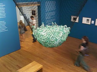
            Before stepping into the exhibition space, my mind screamed ‘water’ faster than you can say it.  As I was walking down the Zimmerli staircase, the only subject dominating the periphery of my vision was a net full of water bottles. That became the first installation to not only attract my interest, but focus it on the essence of water, as the water filled bottles lured me into being thirsty for at least the next hour.
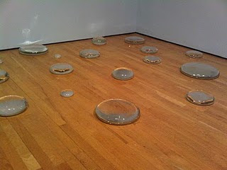
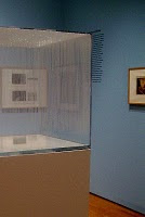
            There was no way that feeling of thirst would go away, thanks to the brilliant  organization of the show by Donna Gustafson. Entering the next room, Hans Haacke’s “Condensation Cube” took me away as it not only depicted water in its state but also its process. Along with Maya Lin’s  “ Dew Point” and “Pin River” the show exalted innovation and diversity in the contemporary arts. These installations were well complimented with a multitude of photographs which depicted the natural wonder in a variety of contents. Whether from its polar life depiction, its mere function, or the affect it has on the environment and people, it all came down to the fact that they all made me thirsty.

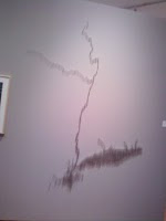
            The exhibition not only gave me answers of what it is water can do, but posed questions regarding its presentation; Especially Maya Lin’s “Pin River”. Lighting was essential in this piece, as a particular cast shadow depicted the flow of a river. The artist wasn’t there to install the work, nor to give it intended lighting. However it was up to the curator to decide on the lighting. Should the curator now take some credit for such work? Unfortunately, I couldn’t figure it out since I was too busy searching for a water fountain.

            All the pieces seemed to flow well with one another, as a river would. There  were only a few boulders which disrupted its flow. The integration of  18th and 19th century work into a space filled with a new fresh smell of contemporary art  personally seemed a bit too disruptive. It was almost as if the curator had a little too much extra room to fill after the more exuberant pieces were installed. At least they made me feel less thirsty.

            Regardless, the show was rich and powerful in its portrayal of our precious natural wonder. From the installations to the photographs and paintings, my eyes kept widening as I walked from one space to another.  Needless to say, my thirst was quenched as I indulged myself in water at a near by water fountain as I ended my viewing of “Water”. That is a sign of a successful curatorial job.


 The Ice and Ark piece made an enormous impact on my first impression, I would use it to lure the viewer in and let such installations be expected.


Maya Lin's "Dew Point" would fit in will with installations the shown pieces, since it has a physical effect on the viewer as the others.


The Condensation Cube portrays water while in its process. It would compliment the other depictions of water, where the content is specialized around its state of being. 


 The Pin River adds more variety to the room filled with the other three pieces, as the view learns to recognize the importance of light in its presentation.